An overview and dive into the features and calculations of the Group Consolidation Dashboard within the Sculpture Analytics tool.
This feature is exclusively accessible to clients with multiple venues.
Overview
The Group Consolidation Dashboard is designed for clients with multiple venues that utilize any of Sculpture Hospitality's services. The data shown in the charts and graphs is a summary, typically based on a selected timeframe unless stated otherwise.
Table of Contents:
- Sales Mix Breakdown
- Stock On-Hand Breakdown
- Actual vs. Ideal Gross Margin
- Location Performance Summary
- Actual vs. Ideal Gross Margin by Location
Sales Mix Breakdown
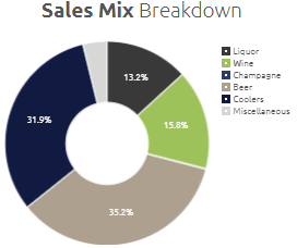
This pie chart style visualization is the summary of sales data combined from all venue locations listed under the Location Performance Summary.

These figures, presented as a percentage (%), are derived from the point-of-sales files, or manually entered sales data that have been captured for all venues over the timeframe identified at the top of the screen via the drop-down option. These total values are then grouped together and displayed.
Displayed at our highest level, Classification, each slice of the pie chart has a hover tool-tip feature that will provide more details.
Sculpture Hospitality experts build and update every single recipe and ingredient and match it with the point-of-sale system. This allows our system to provide insights from the most basic, to the most granular.
Stock On-Hand Breakdown
A pie chart style breakdown, similar to the Sales Mix Breakdown, displaying a summary of the value of the On-Stock overall venue locations listed under the Location Performance Summary.
These figures, also presented as a percentage (%), are derived from totaling all on-hand stock and then grouping the data together by the item classification.
Actual vs. Ideal Gross Margin
A dual pie chart style breakdown, comparing Actual Gross Margin and Ideal Gross Margin values.

Sculpture Hospitality has the unique opportunity to provide a client with a measured Actual Gross Margin versus their Ideal Gross Margin. This is because we count and weigh every item on-site.
Comparing these two figures, presented as a percentage (%), allows an owner to better understand their production costs related to the revenues capture through their recent sales.
Want to learn more about Gross Margin?
Location Performance Summary
This table visualization displays a summary of information for all venues associated with the login used to access this report. Selecting any of the venues in the "Name" column will open a new window, displaying the Overview Report for the particular location.
The information displayed is specific to the venue by the timeframe selected in the drop-down at the top of the page. The GRAND TOTAL row is a summation or calculation to accurately reflect the group's performance as a single unit.

Where do these figures come from?
-
- Revenue : Captured from Sales data, broken down by recipe ingredient quantities.
- Total On-hand Cost : The total monetary value of all measured on-hand stock.
- Stock On-hand (in Weeks) : An estimated calculation of how long the current measured inventory would last without replenishment based on usage.
- Liquor, Keg, Wine Variance : A percentage (%) representation of sold quantities vs. measured usage of each brand, grouped by the corresponding brand classification.
- Gross Margin : Also know as "Actual Gross Margin", is a percentage (%) representing the difference of revenue and the measured cost of the products used.
-
- Ideal Gross Margin : A percentage (%) representing the difference between revenue and the cost of the goods sold. This figure assumes all recipes are made perfectly with no loss.
Actual vs. Ideal Gross Margin by Location
A comparison bar chart style visualization representing the Actual Gross Margin vs. Ideal Gross Margin for all venues associated with the login used to access this report.
A tool-tip feature allows an individual to review the specific figures corresponding to the chosen column within the bar chart.

