An overview and dive into the calculations and features of the Overview Tab.
Features accessible to all users with report access.
Overview
The Overview Tab is the default landing page after accessing a single venue from Sculpture Hospitality's Group Consolidation report or, if only one venue is assigned to the login used, the first page you land on when logging in. The figures displayed within the charts and graphs are specific to the venue, based on the chosen timeframe, listed in the header.
Table of Contents:
Loss at Cost
The Loss at Cost figure represents the purchase or wholesale value of the missing product and how much it would  cost to replace it. Sculpture Hospitality is able to add up all the missing inventory by a user's unit of measure preference and display cost by that unit.
Ex. mL, oz, Imp Oz, cL, 100-mL
PRO TIP!
Positive Losses - If your report displays a positive figure, this means your usage is less than your sales quantities resulting in an unexplained gain in on-hand inventory. This could be from numerous under pours, a misconfigured recipe, or something else.
Revenue Potential

Revenue Potential represents the value of the additional monies a venue would have earned if every loss or shortage had been sold to a consumer at retail value.
Stock On-hand (in weeks)

How is stock on-hand estimated?
The value represented in this report is an estimated calculation of how long the current measured inventory would last without replenishment based on usage.
Actual Gross Margin
Gross Margin is a percentage (%) representing the difference in revenue and the measured cost of the products used. 
Want to learn more about Gross Margin?
Ideal Gross Margin
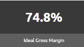
An Ideal Gross Margin is the difference between revenue and cost of the goods that have been sold. This is then divided by revenue and displayed as a percentage (%).
This is called "ideal" as it assumes that no loss has occurred.
Sculpture Rating
What is a Sculpture Rating? The Sculpture Rating is an efficiency calculation based on the
 difference between a venue's measured Pour Cost and their calculated Ideal Pour Cost.
Most Sculpture clients expect a Sculpture Rating of 97% or higher.
Interested in learning more about what your Pour Costs Should be?
Historical Sculpture Rating
This historical timeline displays the Sculpture Rating over a timeframe of up to 15 periods or roughly 1 quarter.
This chart contains a tooltip feature, allowing a user to hover over and see the Sculpture Rating at each plotted point.

Actual vs. Ideal Gross Margin
Sculpture Hospitality has the unique opportunity to provide a client with a measured Actual Gross Margin versus their Ideal Gross Margin. This is because we count and weigh every item on-site.
Displayed as a historical line graph, this chart represents a measured gross margin vs. a calculated gross margin over time. This chart contains a tooltip feature, allowing a user to hover over and see the gross margins at each plotted point.

Comparing these two figures, presented as a percentage (%), allows an owner to better understand their production costs related to the revenues capture through their recent sales.
Want to learn more about Gross Margin?
Pour Costs
A pour cost is a percentage representation of of cost that a drink costs to create compared to the resulting sales of the product. A pour cost can be calculated by taking the total cost of a drink's ingredients and dividing it by the sale price of the drink.
Interested in learning more about what your Pour Costs Should be?
On-hand Cost
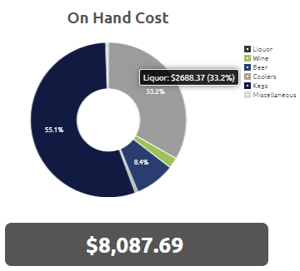
This pie chart style breakdown represents the total monetary value of all measured on-hand stock during the timeframe identified in the header at the top of the page.
This chart groups brands together by Classification and each slice of the pie chart has a hover tooltip feature that will provide more details.
The field below is the summation of all the classes of brands, displaying a total on-hand cost.
Sales
This pie chart style breakdown represents the totals sales of this venue during the timeframe identified in the header at the top of the page.
This chart groups brands together by Classification and each slice of the pie chart has a hover tooltip feature that will provide more details. The field below is the summation of all the classes of brands displaying a total amount of sales.
These figures are typically exported from the venue's Point-of-Sale system and imported into the Sculpture Hospitality inventory platform either manually or automatically.
Used Cost
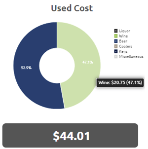
This pie chart style breakdown represents the cost of the product that has been used up since the previously measured inventory, taking into consideration purchases.
This figure is different from Cost of Goods Sold and Sold (cost) where those figures are theoretical, assuming no slippage or spills.
This chart groups brands together by Classification and each slice of the pie chart has a hover tooltip feature that will provide more details. The field below is the summation of all the classes of brands, displaying a Total Used Cost.
Historical Revenue
This historical timeline displays the Revenue over a timeframe of up to 15 periods or roughly 1 quarter.
This chart contains a tooltip feature, allowing a user to hover over and see the revenues at each plotted point.

Historical Purchases
This historical timeline displays the total value of all purchases over a timeframe of up to 15 periods, or roughly 1 quarter.
This chart contains a tooltip feature, allowing a user to hover over and see the purchases at each plotted point.
