An overview and dive into the features and calculations of the Sales Tab.
Features accessible to all users with report access.
Overview
The Sales Tab displays key figures specific to profit, revenue, and sales for the venue listed in the header, based on the chosen timeframe. This includes key sales metrics, historical revenue, cost, and gross margin charts, revenues are broken down by classification, and top 10 ranking tables.
Table of Contents:
Revenue
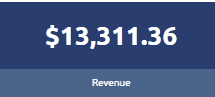
The Revenue figure displays the sales volume of the venue during the time frame identified in the header bar. These numbers are calculated based on the quantity sold multiplied by the price point of each of those drinks provided by the point-of-sale system.
Depending on the point-of-sale system and processes in place in the establishment, this number may include recorded spills, if costs are assigned, non-alcoholic items, and more.
Used Cost
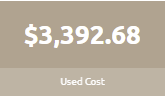
This data figure represents the summation of all the classes of the product that has been used up since the previously measured inventory, taking into consideration purchases.
This figure is different from Cost of Goods Sold and Sold (cost) where those figures are theoretical, assuming no slippage or spills.
Gross Profit
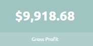
The Gross Profits figure represents the difference between the costs of the products sold and the revenue generated from the sales of those products.
Gross Margin
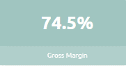
This percentage figure, also known as "Actual Gross Margin", is a percentage (%) representing the difference of revenue and the measured cost of the products used for the client during the defined timeframe in the header.
Want to learn more about Gross Margin?
Ideal Gross Margin
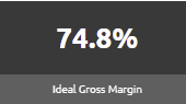
This percentage (%) figure represents the difference between revenue and the cost of the product sold. This figure assumes all recipes are made perfectly with no loss.
Ideal COGS
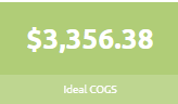
This dollar figure represents the value of the inventory items sold by the client during the defined timeframe in the header.
With this figure being the ideal value, it is assuming that no losses have occurred in any capacity.
Historical Revenue vs. Used Cost vs. Gross Margin
This historical line graph compares Revenue, Used Cost, and Gross Margin over a timeframe of up to 15 periods, or roughly 1 quarter.

The information displayed in this chart is great for quickly determining a client's profitability. The client would like to see the largest gap possible between revenue and used costs, resulting in the highest possible gross margin.
Revenue Breakdown by Class
This pie chart and table combination style visualization acts as a responsive control to the charts and graphs below it.

PRO TIP!
Select a class within this chart and watch the Top 10 charts change! Use the "up one level" button to go back.
Overall - Top 10 by Revenue $
This table visualization displays a summary of products, ranked from 1 to 10, based on the product's revenue, ranked highest to lowest. To see a complete list of all products you can drill down further by selecting the “Full List” button in the top right of the table.
 Additionally, a user can reverse sort the list to displays the lowest revenue items and save the file to .csv.
Where do these figures come from?
-
- Revenue : See Above
- Cost : The retail value of the product sold
- Gross Profit : See Above
- Gross Margin : See Above
- Ideal Gross Margin : See Above
- Difference : The difference between Gross Margin and Ideal Gross Margin
Overall - Top 10 by Ideal GM %
This table visualization displays a summary of products, ranked from 1 to 10, based on the product's ideal gross margin, ranked highest to lowest. To see a complete list of all products you can drill down further by selecting the “Full List” button in the top right of the table.
Additionally, a user can reverse sort the list to displays the lowest ideal gross margin items and save the file to .csv.
Where do these figures come from?
-
- Revenue : See Above
- Cost : The retail value of the product sold
- Gross Profit : See Above
- Gross Margin : See Above
- Ideal Gross Margin : See Above
- Difference : The difference between Gross Margin and Ideal Gross Margin
Overall - Top 10 by Profit $
This table visualization displays a summary of products, ranked from 1 to 10, based on the product's gross profit, ranked highest to lowest. To see a complete list of all products you can drill down further by selecting the “Full List” button in the top right of the table.
 Additionally, a user can reverse sort the list to displays the lowest ideal gross margin items and save the file to .csv.
Where do these figures come from?
-
- Revenue : See Above
- Cost : The retail value of the product sold
- Gross Profit : See Above
- Gross Margin : See Above
- Ideal Gross Margin : See Above
- Difference : The difference between Gross Margin and Ideal Gross Margin